

The Tyne and Wear Metro is an essential part of modern North East life. In a region where car ownership levels are much lower than the national average, public transport providers such as Nexus’ Metro offer crucial services for the people of the region. Metro’s yellow and black logo has become easily distinguishable on the landscape of Tyne and Wear, signifying quick transport links between the cities, suburbs and smaller towns of the area.
Opened in 1980, the Metro system began by recycling stretches of disused lines from the heyday of industry, joining up parts of the old Newcastle and North Shields Railway, the Blyth and Tyne Railway and the Brandling Junction Railway.
Since the early 1990s it has slowly branched out, extending its services towards Newcastle Airport and Sunderland, uniting the two major conurbations of the region in the process. Tyne and Wear Metro has become the second largest, after the London Underground, of the four metro systems in the United Kingdom and in 2015 serviced over 40 million passengers.
Its position as partially privatised – publicly owned by the government but operated by private companies – has, however, been particularly contentious. Since 2010, the system has been run by DB Regio (Tyne and Wear) Ltd., a subsidiary of German railway operator Deutsche Bahn, whose service has been heavily criticised for its lack of efficiency, overcrowding, technical problems and train failures.
Moving against the logic that the market supplies the most effective service, Nexus has decided to bring DB Regio’s contract to a close by March 2017, and return the Metro, against the wishes of central government, to public service. It will have two years, between 2017 and 2019, to show what can be achieved by a publicly-run railway.
If the future of the Metro service is now looking momentarily brighter, Nexus have also recently released bold plans to extend the system to areas overlooked by the current set-up. In these proposals, the West End, South Gateshead, Team Valley, Washington, Silverlink and Seaham will all become linked to existing lines and one another.

As the developers of the Metro have always been aware of the great cost of building new lines, we may point towards the old Tyne Valley Line – which stretches from Newcastle out to the West End and beyond – as representing a prime case for redevelopment: Elswick, Scotswood and the City Centre are already linked by unused railways. The West End is one example of a heavily populated area which has been neglected by the Metro. Expansion could help many communities profit from greater connectivity.
Further proposals, not included on the map above, include extending the Metro system towards Blyth and Ashington in Northumberland – two towns which have in recent history bore the brunt of deindustrialisation and major decline – and Peterlee, the New Town T. Dan Smith once spoke of embodying the scientific and technological future of the North East, in County Durham.
If such developments receive government funding they will do much to right the privileges of the present arrangement. The Metro currently services the more affluent areas of Tyne and Wear – the city centres, Gosforth and Jesmond in the North, Tynemouth and the Coast to the East – and ignores the less prosperous zones on the peripheries.
***
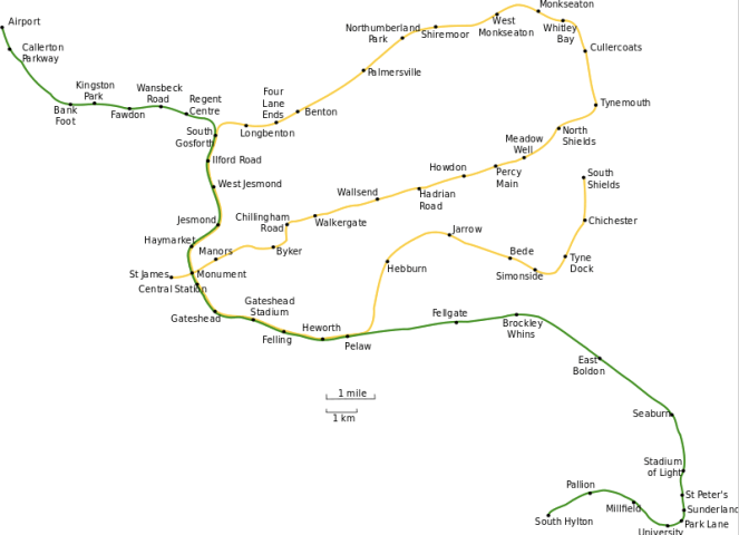
For the residents of the region that have access to the Metro, the map, shown at the top of this page, has become the dominant means of imagining Tyne and Wear as a geographical space. For every journey taken on the train, one will come in contact with this map multiple times, on both the platforms and within the trains itself.
The map sketches out the familiar features of Tyne and Wear: the two rivers, the coast, the city centres, the recognisable towns along the banks of the Tyne and Wear. It allows us to see the region as a whole through its yellow and green lines, and points us, and tourists, towards its most notable places.
The second map, shown above, is the first attempt to correct the faults of the former. Some of those areas and towns made invisible are ready to be seen. We suddenly remember that the West End, Washington, Seaham and other places exist.
Yet, the first map does not just keep the less prosperous areas of the region hidden, it also distorts the geographical features and layout of the Metro stations. Here is a geographically accurate depiction:
And here is what the two Rivers and Coast actually look like:

The straight lines of the rivers and coast are here shown to bend and undulate across the landscape of Tyne and Wear, clashing with the representation of the region illustrated on the first map.
Although it was clearly not designed to be fully representative of the geographic spaces of Tyne and Wear, reminding ourselves that there is more out there than what first meets the eye cannot do much harm.

Good write up. I’d love for the whole publi transPort system to be all publicly ran like it was first designed in the 80’s before thatcher privatised everything. We now have metro and buses competing with each other instead of supplementing each other with passengers.
LikeLike
Interesting read – thanks
LikeLike
Privatisation only works when it has the full support of the local authority and staff. T&W is one of the last regions of the UK that is still convinced that the policies of the 1970s actually worked. They see no connection between that faulty recollection of British socio-economic history, and the fact the area remains deprived, depressed and shunned by private investment.
LikeLike
Exactly what example of privatisation working brilliantly do you have in mind? Water? Telecoms? Railways? It’s not just T and W, the whole flipping country’s seen enough – and had enough – of privatisation.
LikeLike